Ambroseli
Logo Design & Liqueur Packaging


Design Solution
The goal of the Ambroseli brand design was to capture the elegance of Greek mythology in a clean, modern way while reflecting the natural ingredients and luxurious character of the liqueur.
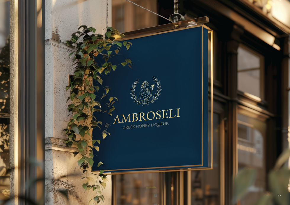
The primary logo features a line illustration of a Greek goddess in a Greek-inspired brench frame, holding a cocktail glass. Symbolizing both the drink’s roots and a modern cocktail style new drink. The wordmark uses a serif font with a custom “A” that includes a small leaf branch, linking back to Greek nature. The monogram “A” can be used alone for small applications, supported by a simplified symbol derived from the main logo.
EB Garamond serves as the primary typeface, bringing classical beauty and a timeless feel to the brand. Figtree is used as the secondary font for clean, modern readability in body text.
The palette pairs Midnight Blue and White for a clean, elegant base. Ocean Blue, Soft Blue, and Sand add softness and a coastal feel, while Gold brings a touch of luxury. Black is used sparingly for text. The overall feel is refined, calm, and timeless.


