Carrie CBD
Branding Identity
About The Brand
CarrieCBD is a wellness brand that creates handcrafted CBD salves and bath soaks using natural, botanical ingredients. Founded by Carrie, the brand began with a deeply personal story—seeking relief from PTSD and chronic muscle tension, she started experimenting with CBD blends when nothing else worked. What started as a personal remedy soon turned into a product that friends, family, and eventually loyal customers began to request again and again.
The brand is rooted in small-batch care, intentional craftsmanship, and real results. Unlike many competitors that focus heavily on plant imagery and trendy aesthetics, CarrieCBD stands out through its honesty and calm presence. Carrie doesn’t aim for mass production or hype—she focuses on helping people feel better, one thoughtfully made product at a time. That authenticity became the foundation for the brand identity.
The design challenge was to translate this honest, handmade philosophy into a modern visual identity that feels both premium and personal. It needed to appeal to a health-conscious audience while staying true to Carrie’s values: calmness, healing, quality, and care. The result is a clean, minimalist brand that speaks quietly but confidently, grounded in nature and driven by purpose.


Design Solution
Logo Design
The logo for CarrieCBD was designed to reflect the heart of the brand: personal care, healing, and handcrafted quality. At its core is a simple, elegant line-style symbol of a hand holding a calendula flower. This image captures the essence of what makes the brand unique—each product is made by Carrie herself, in small batches, with healing and intention behind every step. The hand represents craftsmanship, care, and connection, while the calendula—a key ingredient in her products—symbolizes natural relief and gentle healing.
The typography is a refined serif wordmark, chosen for its classic and trustworthy tone. It brings a sense of calm professionalism and subtle luxury to the brand. The letterforms are slightly customized to feel personal, while still remaining clean and versatile.
Color Palette
The color palette blends emerald green (natural, premium), dark and light lavender (calming, healing), lime (fresh energy), white (clean, simple), off-white (warmth), and black (contrast and sophistication). These colors reflect the brand’s values—natural, soothing, and carefully made.
Typography
A classic serif font was chosen for the logo and key headings to give the brand a premium and trustworthy feel. It’s paired with a modern sans-serif for body copy to ensure readability in all formats, from packaging to web.
Illustrations & Pattern
Custom line-style illustrations include: a bathing girl, mortar & pestle, candle, calendula, and a water drop. These elements communicate the brand’s focus on relaxation, handmade care, and plant-based healing. They are combined into a subtle, elegant pattern used across packaging and printed materials.
.
Overall Aesthetic & Brand Application
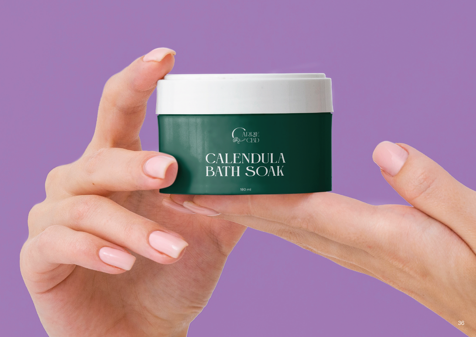
The overall aesthetic is minimalist, clean, and calm—with subtle handcrafted details. It reflects a brand that is personal but polished, natural but premium. The identity was applied to packaging, labels, print, and digital touchpoints in a way that feels consistent, soft, and approachable—designed to stand out on boutique shelves while staying true to the brand’s personal roots.


Take a look at the final


