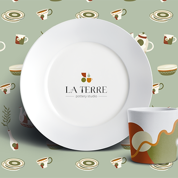
La Terre
Branding & Packaging Design
History
La Terre - a small pottery studio offering a wide range of workshops to help their customers and clients get started with exploring the art of pottery.
As they’re a pottery studio, they would like some earthy tones to be part of their brand to create a sense of warmth and unity but don’t want their brand to look like every other pottery studio out there.


The Result
The LogoThe logo symbolizes the ancient art of pottery by discovering and playing around with different shapes. The whole branding has a unique, warm, and earthy feeling, which can help the customers connect with the brand.
The color palette represents the material, and the pottery process itself. The color combination has a warm, earthy vibe and represents the art itself.