
Puranu
Branding Identity
Puranu is a spiritual wellness brand rooted in ritual, self-awareness, and the sacred feminine. It offers thoughtfully curated tools like ceremony kits, candles, and symbolic objects that help individuals reconnect with their inner wisdom and personal power.
Guided by the belief that transformation begins within, Puranu blends modern elegance with ancient symbolism to support intentional living. Every product is designed to create space for clarity, presence, and meaningful ritual in everyday life.

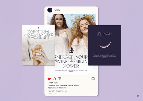
Design Solution
The design solution for Puranu began with a thorough exploration of the brand’s purpose: supporting spiritual transformation through ritual and sacred tools. The goal was to create an identity that feels elevated, calm, and spiritually grounded, without falling into cliché or horror, witch aesthetics.
The final brand system features a custom celestial symbol composed of four key elements: the moon, sun, star, and planet, symbolizing alignment and inner power. The wordmark uses refined typography with subtle customizations to add uniqueness while maintaining clarity. A soft, mystical color palette supports the brand’s emotional tone and flexibility across print and digital. The result is a cohesive identity that balances modern elegance with spiritual depth, designed to grow with the brand across product lines and touchpoints.
The logo system is built around a custom celestial symbol composed of four key elements: the crescent moon, sun, star, and planet. Each shape was chosen for its meaning and arranged in a balanced structure that represents alignment and self-guidance. The wordmark uses an elegant serif typeface with subtle customization, including a redesigned “P” and integrated star, to create a unique but understated presence. A separate emblem variation with the script “P” offers flexibility for small-scale or decorative use.
The color palette includes deep indigo, light lavender, and ivory tones chosen for their emotional resonance, softness, and versatility. These shades help evoke a sense of calm, depth, and sacred space.
Typography combines the expressive Tokyo Dreams typeface for headlines with a clean, neutral sans serif for body content. This pairing balances emotional tone with clarity, ensuring the brand feels both elevated and accessible across printed materials, packaging, and digital formats.
Illustrations are used sparingly to support the brand’s minimal and refined tone. Elegant drawings of botanical vines, feminine spirit, and celestial motifs serve as visual extensions of the brand’s symbolic language.


Take a look at the final


