Oh Mochi!
Brand Identity & Packaging Design
History
Oh Mochi! A Japanese delicacy handmade in-store packed with a variety of flavors and fillings. Ran by a couple who loves all things sweets, Oh Mochi quickly expanded after inventing so many funky flavors!
Mochi is a Japanese rice cake made of mochigome rice, and sometimes other ingredients such as water, sugar, and cornstarch. The rice is pounded into paste and molded into the desired shape. In Japan, it is traditionally made in a ceremony called mochitsuki. While eaten year-round, mochi is a traditional food for the Japanese New Year and is commonly sold and eaten during that time.
Challenge
With a wide variety of flavors, Oh Mochi brings an inventive touch of classic sweets. They wanted fun, innovative branding such as their products.


The Result
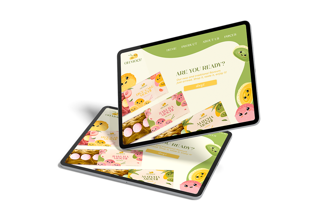
The characters in the logo were inspired by the classic mochi Japanese rice cake, with a fun and adorable touch to represent the brand's funky essence, but also to honor the Japanese culture. The typeface in the logo was carefully chosen, to give a premium slick vibe to the characters.
The brand colors were chosen from the original classic mochi flavors, Sakura Mochi, Matcha Mochi, and Rise Cake Mochi. They are perfectly aligned with the innovative, joyful vibe of the brand.