top of page
Sky & Sol
Branding Identity & Packaging Design
Sky & Sol is a natural skincare brand that creates products using ingredients that are safe enough to eat. Many of their customers purchase their products due to their health benefits and eco-friendliness. Although some of our customers follow a carnivorous or meat-based diet, their products are not plant-based. They use tallow, which is animal fat, but they ensure that it is sourced from regenerative pastures that help revive dead ecosystems.
Sky & Sol are firm believers in using ingredients that have been around for centuries. They trust these ingredients because they have been proven to work and are safer. They trust in the healing power of nature and advocate for going back to one's roots.

Design Solution
The branding has been developed to a brand that focuses on revitalizing, renewing, and promoting purity. The logo design is minimalistic yet warm, featuring an organic sans-serif typeface and a separate hummingbird bird symbol. The typeface is classic and simple, complemented by a second sans-serif font. The sub-logo features the brand's initials, S, S&S, and customized with the hummingbird elements. The bird symbol represents the persistent nature of hummingbirds in seeking nourishment, symbolizing the brand's commitment to providing nourishing and caring products for the skin.
Customized Letters - The letters have been customized to achieve a unique and memorable appearance. The letters "y" and "o" have been creatively stylized by cutting parts of the letters to create negative space. Shortening the name was also a strategic decision due to its length. Symbol - focuses on revitalizing, renewing, and promoting purity.
The symbol has a minimalistic yet elegant style.
The bird symbol represents the persistent nature of hummingbirds in seeking nourishment, symbolizing the brand's commitment to providing nourishing and caring products for the skin.
The brand elements and pattern consist of a simple and elegant hummingbird pattern.
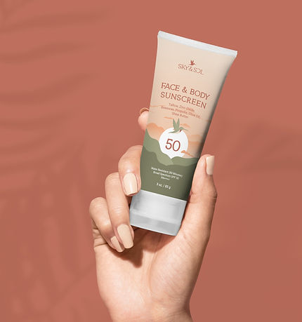
The packaging is inspired by the renewal and airy aspect of the branding, keeping it simple, yet elegant.
The color palette draws inspiration from hummingbirds, featuring sage green, bone white, orange, and warm terracotta. This color combination emphasizes warmth, nourishment, and natural ingredients, highlighting that sunscreen should be worn at all times, not just at the beach.


bottom of page